
Colour
Colour sits at the core of how we experience art. It feels intuitive — we recognise it, respond to it emotionally, and understand that artists use it with intention. But colour is not fixed. Its role has evolved alongside techniques, materials, and ways of seeing.
Until the late 15th century, European painters rarely used colour to define form on its own. Shapes were outlined first, then filled in. The development of oil paint changed this. Artists began working in a more painterly way, allowing colour itself to construct form through layers, blending, and subtle transitions.
Around the same time, painters started distinguishing what is known as local colour — the natural colour of an object seen in clear daylight. This shift marked a move towards observing the world more carefully, rather than relying on symbolic or predefined palettes.
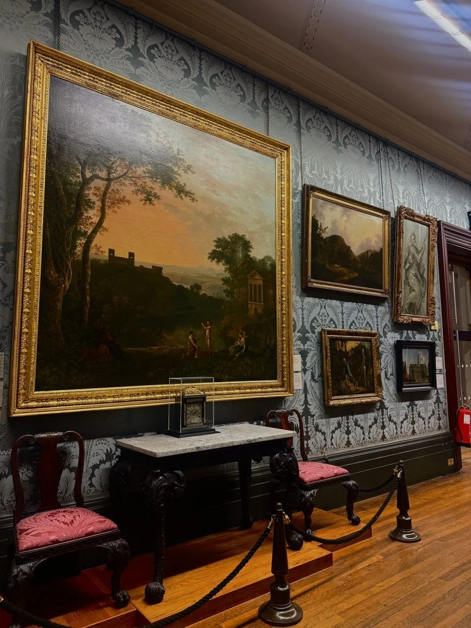
Installation view, The Walker Art Gallery, 2026. Photo: Art & Butter.
Colour also became essential in creating depth and volume. Through chiaroscuro, artists used strong contrasts between light and dark to model three-dimensional forms. Importantly, this was not just about shading a single tone but also involved reflected light, making surfaces feel more real and atmospheric.
In landscapes, colour played another role. Through aerial perspective, distant elements appear softer, less contrasted, and more muted in tone. To strengthen this illusion, artists often used repoussoir, which meant placing a dark, solid form (such as a tree) in the foreground to emphasise depth.
Together with linear perspective, these techniques allowed artists to construct convincing illusions of space. The goal, particularly between the 15th and mid-19th centuries, was verisimilitude — an appearance of visual truth. Paintings were meant to feel believable, whether depicting religious scenes, portraits, or everyday life. If something looked true, it reinforced the idea that its message was also true.
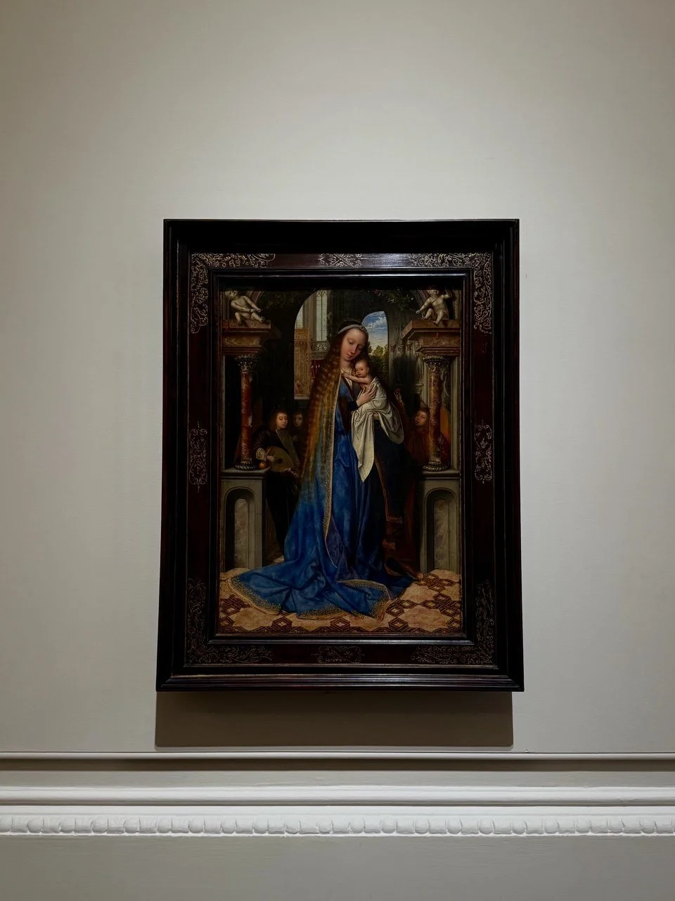
Quinten Massys, The Virgin and Child with Angels (1500-1509), installation view, The Courtauld Gallery, 2026. Photo: Art & Butter.
By the 19th century, this approach began to shift. Artists started questioning whether traditional techniques could fully capture what the eye actually sees — especially in nature, where light constantly changes. Colour was no longer just descriptive; it became something more fluid, subjective, and responsive.
Beyond representation, colour has always carried symbolic and emotional weight. In religious art, for example, the blue of the Virgin Mary’s robe suggests something celestial. More broadly, colour shapes mood: dark tones can feel heavy or melancholic, while light, bright hues suggest energy or joy. Soft transitions create harmony, while sharp contrasts can feel unsettling.
Colour, then, is never just decoration. It is structure, illusion, emotion, and meaning all at once.
Based on Hugh Honour’s & John Fleming’s A world History of Art